Books as Aesthetic Objects
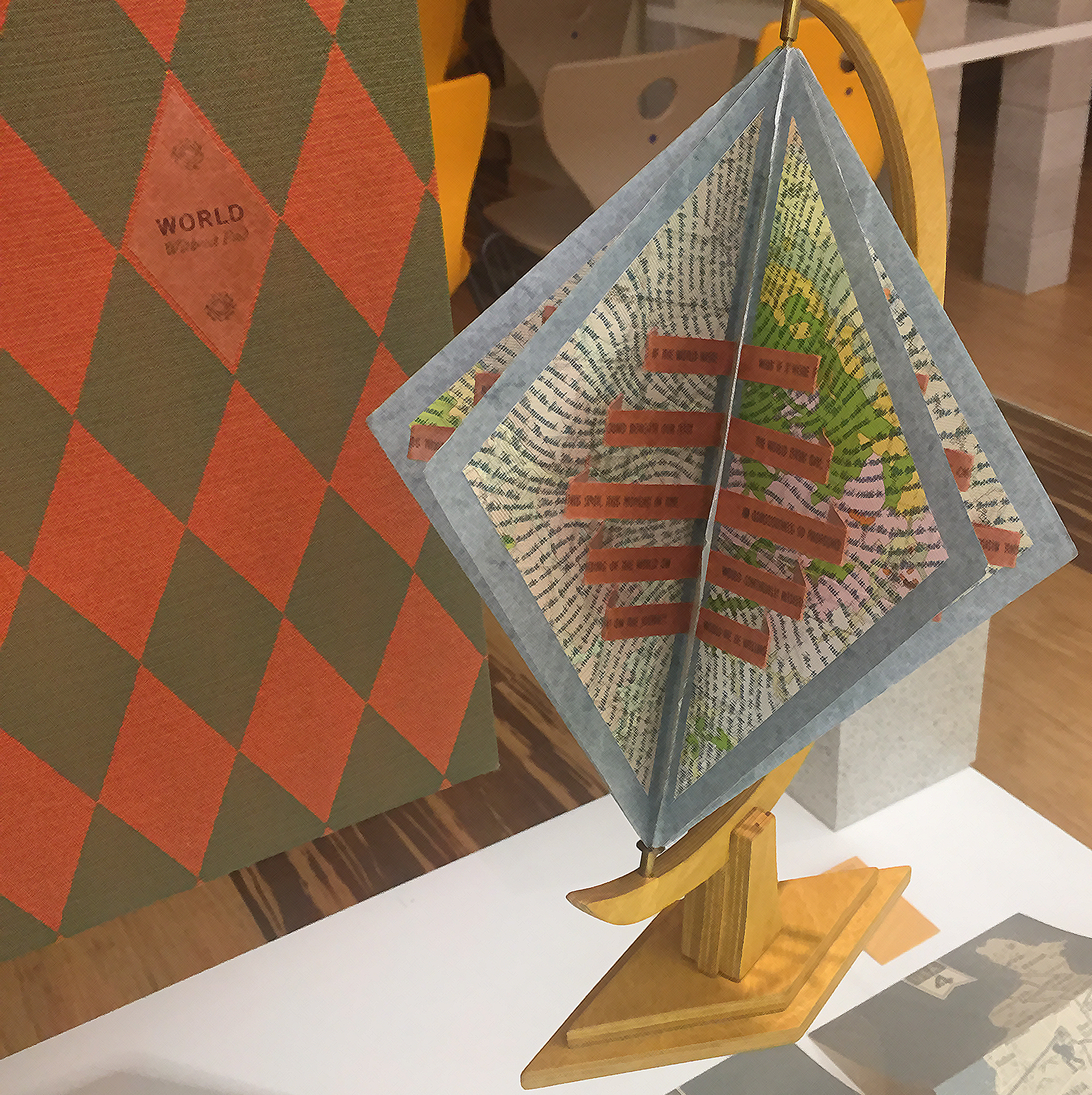

The essential focus of the collection is on artists' books
By Russell Maret
2001
I once heard Martha Stewart say that ‘K’ was an awkward center letter in a monogram, but unfortunately I have no choice. Perhaps if she had seen the ‘K’ Russell Maret designed, she would better appreciate a gorgeous ‘K,’ standing alone. That said, I am most in love with the ‘P’ and may change my name.
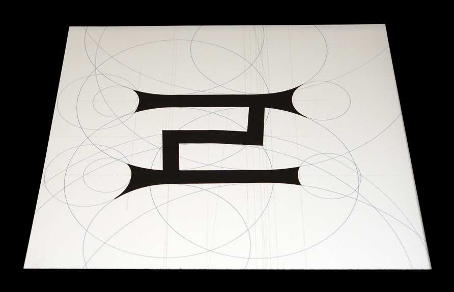
There are at least two ways of approaching this book, further titled twenty-six letters rendered with compass and straightedge: to examine the individual unbound sheets and appreciate the strength and beauty of each letter boldly set against a background of geometric points and intersections; or to read the prospectus and understand Maret’s oeuvre from his point of view.
The former method introduces the questions: the prospectus delivers the answers. Why are letters definitively unrelated in shape? Why do they sometimes require interpretation? Why are the background grid lines grey and the circular lines blue? And who is Nicolete?
TMaret’s prospectus answers them all, but the viewer’s delight on uncovering each letter recommends the first method.
Maret points out the difference between designing a typeface and the creation of an isolated letter form. In the former, the letters must relate to one another and must ‘serve language.’ Maret elucidates: "Each letter in Eclectic Geometric is approached as an individual. Any geometry necessary for the realization of its form is employed. Some letters abound with circles and compound curves, some are formed by only a few subtle tapers, the K is composed entirely of lines."
About the background grids and circles he says, "In place of the customary grid upon which geometric letters are drafted, only the required points and intersections... are present, set at a visual distance by virtue of their being rendered in pencil. From these initial points, the component circles... are drawn in blue with liquid watercolor. ...The letters are then outlined in India ink and painted in black gouache."
As in many of the books in this collection, the artist makes himself virtually present. "Every copy is hand measured and drawn according to master drawings, but, due to my fondness for improvisation and the impossibility of precise mechanical reproduction, each copy is in some way unique."
And Nicolete? "Throughout the four year process of Eclectic Geometric,’ one of my principle sourcebooks, and favorite diversions, has been, A History of Lettering,’ by Nicolete Grey. Ms Grey’s obvious affinity and love for letter forms has been a constant inspiration to me. Three years into its making, I decided to sub-title Eclectic Geometric, Lunch with Nicolete, in reference to my on-going conversation with a woman I’ve never met."
Mr. Maret, a printer and bookmaker since 1989, is the proprietor of Kuboaa, a small press which produces fine letterpress editions and one-of-a-kind books.
- Judith Klau
The Jaffe Center looks forward to hearing from you. If you are looking to schedule research hours, bring a community group on tour, or offer us thoughts on your experience in one of our workshops, please send us a message.