Books as Aesthetic Objects
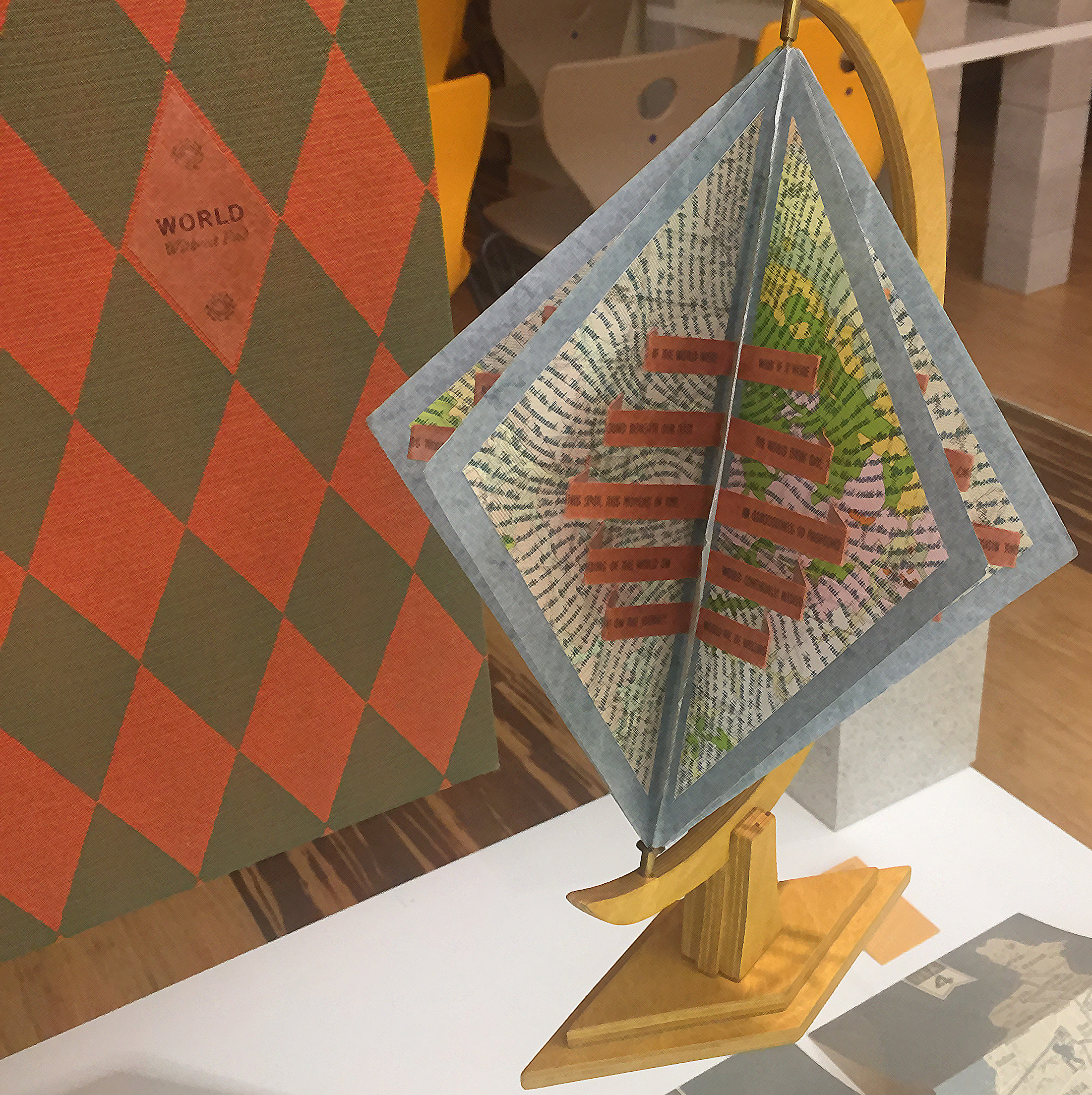

The essential focus of the collection is on artists' books


By Jim Dine
If ever
you wished to peer inside the mind
of an artist, then Jim Dine’s work,
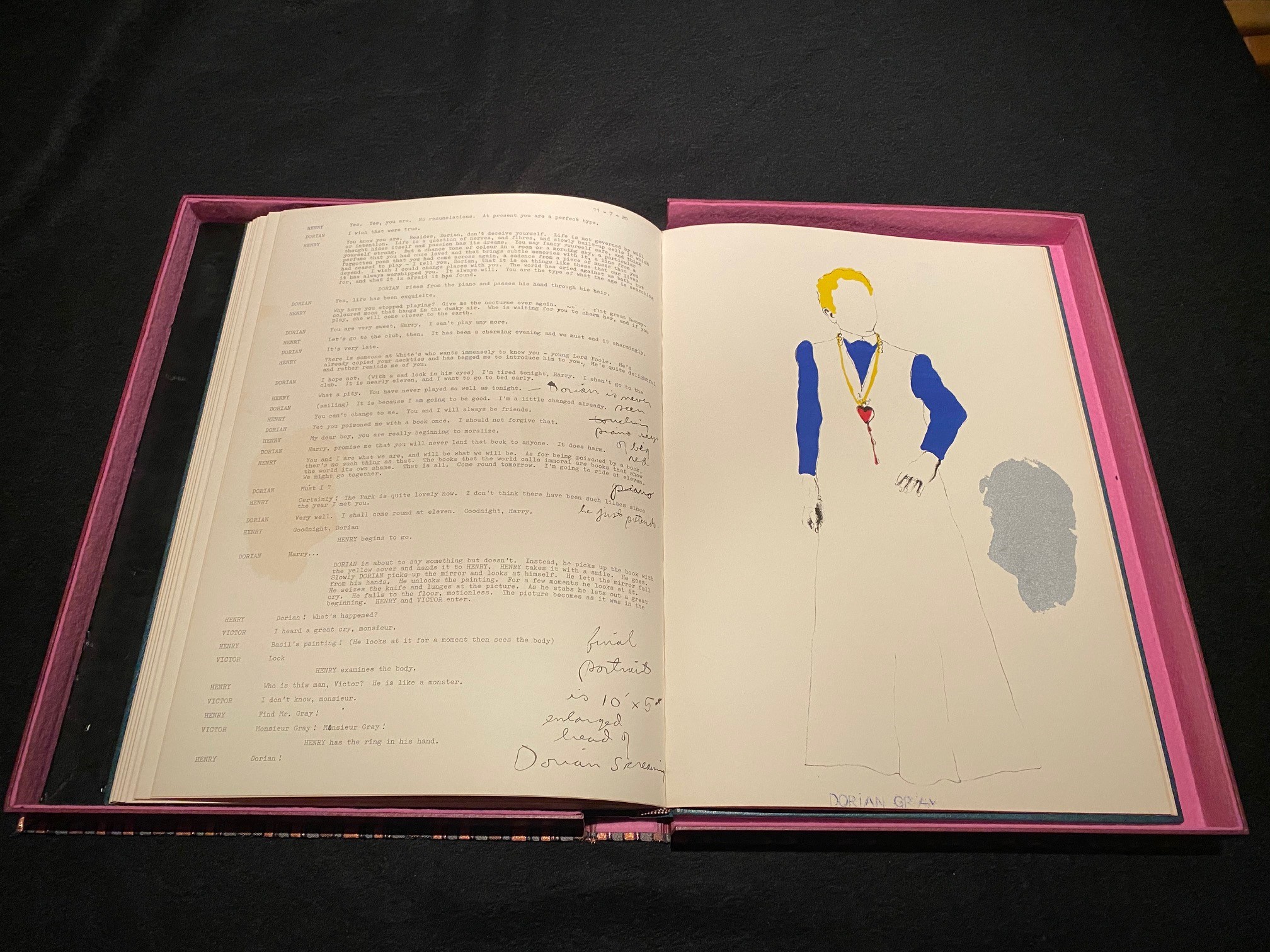
“The Picture of Dorian Gray” is the
perfect book for you. The work
was produced created in
response to a stage production of
Oscar Wilde’s evocative story being
produced by Dine in 1968. The
book itself is an amalgam of the
production notes, script and
artist’s illustrations bound inside
a beautiful leather cover adorned
with silver. In the
process of creating this work, Dine
permits you backstage access into
the mind of an artist under the
strain of taking a literary
masterpiece and evolving it into an
entirely different visionary
vehicle. Dine puts form, shape
and design to the imagined
characters of a story which explores
the depths of the human psyche. You
can feel the tremendous effort in
his diligent craft. He
scripts, rescripts and edits,
designing down to each and every
inch of stage space and surface of
each page in the book.
The story itself,
or the play in this case, follows the
endless life of the book’s protagonist,
Dorian Gray, whom who
ceases to age at some point early on in his
beautiful life. This leads his
endeavors to turn more and more extreme,
sociopathic and depraved in his search to
find meaningful experiences as the world
moves on around him. His own portrait,
which he meticulously maintains, however
devolves with each passing act of
self-interest into a nightmarish caricature
of something truly inhuman. The neo-dada and
unique expressionist art of Dine seems
perfect for what was then the contemporary
retelling of the tale in the late 1960s.
Against the backdrop of a Flower Child
generation fighting against the trappings of
their society and with musicians the likes
of Mick Jagger and David Bowie turning
themselves into onstage Rock n’ Roll
deities, you almost feel like Dorian would
have finally felt at home in this era.
The book itself
does not gloss over the elements of its
revisions and evolution but portrays them
with great effect. If you think that
artistry is strictly a fluid and
serendipitous adventure, you would be
hard pressed find
it difficult to argue your
hypothesis in light of Dine’s great success.
Even in the colophone colophon,
he (perhaps with a playful purpose) is still
correcting his own notes, crossing out
errors and correcting his own spelling
composition. Dine utilized color
lithographs, etchings and text which were
created from aluminum plates printed on
Velin Arch paper. The binding and the
beautiful slipcase was were designed
by Rudolph Rieser in Cologne Germany.
There were two hundred copies made, of which
the Jaffe Center owns number 175.
Finally, if
you are looking for how the all-important
picture of Dorian is portrayed by Dine, you
will be hard-pressed to find it in the book
but this I can promise, it is there staring
you in the face.
Click here for slideshow.
- Eric Bush
The Jaffe Center looks forward to hearing from you. If you are looking to schedule research hours, bring a community group on tour, or offer us thoughts on your expierence in one of our workshops, please send us a message.